...Unique Creative Styles and Content For Animation
Links
Jot Touch 4 + iPad Mini Painting Tutorial #2
A Mini Tutorial/Review on Using the Jot Touch 4 with Procreate on an iPad Mini
Concept
On thing I’ve come to the conclusion with these tools and program, is that having experience doing one thing (Painting) in another program (Photoshop,) carries to any other program you use. For example, the fact that I’ve used Photoshop since it first came out, and I’ve been doing this for the past 20 years, 15 at an Animation Studio, does help. SO I’ve decided to share my knowledge with you so as to prevent you from 1) giving up, 2) get frustrated to the point that you throw your, by now cold, Mocha Frappuccino at the person in front of you, and 3) to make sure that you don’t give up...
Layers Are Your Friends!
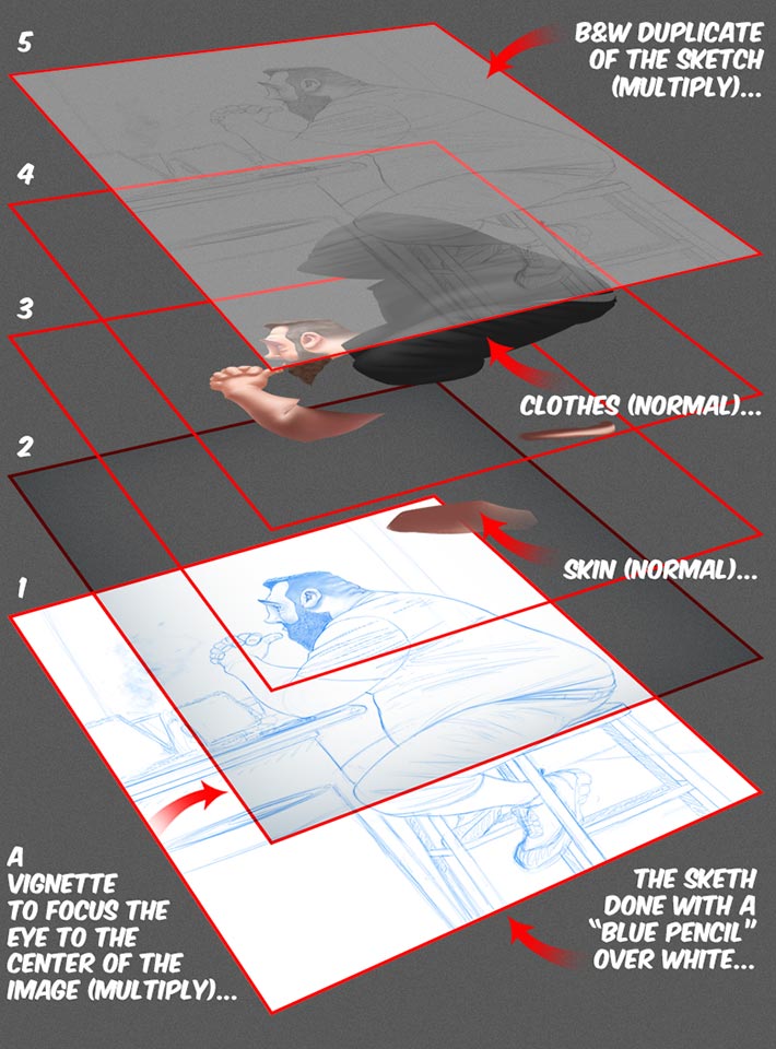
Like I said in the previous tutorial, my process is very simple, and this one is no different: I draw a sketch and using layers and their Modes, and then I proceed to paint bellow the sketch moving layers and changing their “modes,” like Multiply, Hard Lights, Color, Tint, etc, etc.
Here’s what my process would look like in 3D:
Time Yourselves!
Seriously: if you want to get better and faster, time yourself. Use your mobile phone’s timer and set a limit. To start with warm-ups, ten minutes of circles and straight lines. Then I do ten thirty seconds sketches of people... Once I think I’m ready, I spend 5 minutes for a sketch and no more than 10 minutes for a painting of that sketch. If you do this day after day, you will improve 1) your hand-eye coordination, 2) your observation skills - the ability to break things into “iconic” shapes and lines, and c) your speed!
Trust me! It’s a technique used in ALL Art schools around the World for a reason: it works!...
My (simple) Layers’ Setup
Step 1
I quickly draw the sketch. I use a simple brush I’ve tweaked here and there, and I use two or there other layers to paint shades to “understand” the volume and shapes of certain things. I will draw over those shaded layers and eventually merge all the line-layers with the original sketch layer.
You don’t want to merge the shading with a line layer because you do the shading with color...
Step 2
Once I’m happy with the sketch I will duplicate that layer and desaturate the color to B&W (Black ad White)...
Step 3
I “block” shapes of color for the parts that I will paint (skin & clothes in this case.) Use the mid-tone of the color you will use for the blocking, this way all you have to do is add highlights and shadows to create volume & shape!
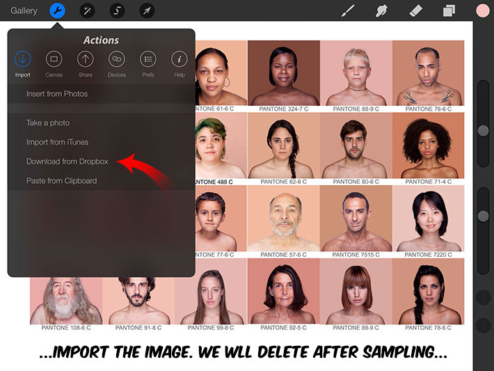
For the skin colors, I “sampled” a palette in Procreate (SEE TUTORIAL FOLLOWING THESE STEPS!)
Step 4
I will then “Lock the Alpha” of the layers with color - so as to not paint outside of the color shapes...
Step 5
I use darker and lighter versions of the mid-range colors...
Step 6
Once finished with the painting, I create a vignette to “focus” the eye on the center of the image. This is how: you create a new layer (in this case ABOVE the sketch and not the color layers...) You then change the mode to Multiply and paint a line of the Gray around the edge. Use the Gaussian Blur filter to blur the line (lots of blur!) and that’s about it...
And that’s about it for the process!
Sampling Colors From Photographs
For this step, I will use an image from Angelica Dass’ humanæ project, “...a chromatic inventory, a project that reflects on the colors beyond the borders of our codes by referencing the PANTONE® color scheme… it’s a pursuit for highlighting our subtle-continuous of our tones that make more equality than difference… our true colors, rather than the untrue Red and Yellow, Black and White. It is a kind of game for subverting our codes. The audience is free to read into it. The ultimate goal is to provoke and bring currently using internet as a discussion platform on ethnic identity, creating images that lead us to match us independent from factors such as nationality, origin, economic status, age or aesthetic standards…” Check it out, its quite amazing!
Now, color sampling. This is how I do it:
Step 7
First, import your image...
Step 8
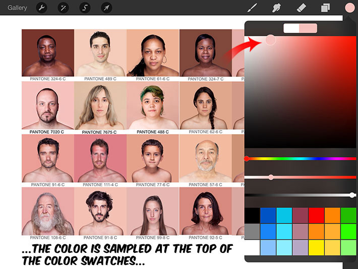
Sample the colors you want - you may want to sample the mid-tones, highlights and shadows from the photographs if you want or just the mid-tones: hold the Stylus over the color you want and WAIT!... you will see this ring with the color you had at the bottom and the new sampled color at the top...

When you open the color Swatches, you will see that the new color sampled is on the top rectangle - see where the arrow is pointing) The previous color - white in this case, is on the left and the new skin-color on the right...
If your swatches at the bottom impede you from dragging/saving this new color, “swipe” the swatches to the left: this will open up new empty swatch-holders...
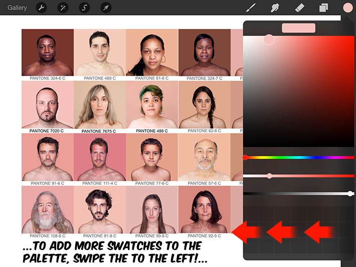
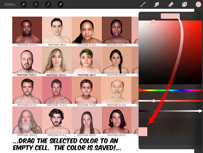
Step 9
Now drag the newly selected swatch to an empty swatch-cell and VOILA! You have sampled and saved a color! Do the same for the highlights, shadow, lip-colors, etc, etc, etc...
Hope this helps anyone with their decision on purchasing a Jot Touch 4 or Procreate!
Cheers!